CBEUG- TAKES A NEW AVaTAR

Ever since we started CBEUG in 2007, it was always few MSPs. As it was in the growing stage we happened to conduct few big events and most of the events in our college itself.
After the Bootcamp v1.0, we realized that there are a lot of MSPs joining the team and if it happens to continue in the same way, it wouldn’t be perfect.
We realized that only if there is a structure built, it could help the user group grow and sustain. We also realized that our dream of winning the best User Group will always remain a dream.
So myself and Abhishek finally decided to revamp the entire User Group. We also realized that revamping helps creating a brand.With a month long of brainstorming and research we finally designed a structure that may be suitable for our UG.
We decided that like any Organization, there will be Presidents in the top of the hierarchy. We decided to have four Vice-Presidents for effective delegation. The Vice-presidents were categorized based on the job role. Like Finance, Communication, Marketing, Club management etc.
As it was a blooming organization we decided this would be the right hierarchy. We built the Hierarchy keeping in mind that this is a student Organization and the governing body will be changing.
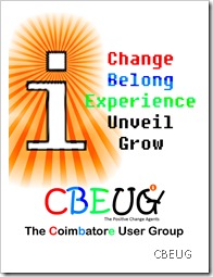
We also had a change in the logo, which would represent the Spirit of the Usergroup. Interestingly if you see the old and the new logo, the transformation of the usergroup can be deciphered.

Initially when we started the UserGroup we just had one point in mind that its a student Organization and more related to Technology. The same thing you can find in the logo. The font seems to be a little informal which indicates its a student Organization and the ‘G’ is a student using a lap top, which indicates that it is more related to technology. At the beginning of the User Group we just had a forum and events more into technology.
Generally the color Orange represents energy, strength and power and usually it means energetic motivator..

The New logo has even more meaning. Our Usergroup starting growing more socialistic along with technology evangelism. The ‘U’ is a smiley. Again the ‘G’ is a student using a laptop which means related to technology. The small ‘i’ indicates innovation. CBEUG generally means COIMBATORE USER GROUP, but it also means Change, Belongingness, Experience Unveil and Grow. This also is the lifecycle of any passionate student. At the beginning he tends to bring change the way he generally is or breaking stereotype. Then he induces belongingness with the group or the place where he is. Later he provides experiences to his peers. Then tries to unveil innovation and tries to do new thing and then grows. This is what we tried to imply.Even the color has meaning. Red indicates enthusiasm, strength and competitiveness. Blue indicates creative, balanced and harmonious. Green represents persistent, decisive and resistant state of mind. We also choose this color to represent the socialistic approach(Go green kind of thing). Again the small ‘i’ orange color is energetic motivator.
Our tag is “The Positive change Agents”.Which itself is self explanatory.
Our Values:
—Bringing Change
—Inducing Belongingness
—Providing Experience
—Unveiling Innovations
—Growing Together
Vision:
—To realize the true student potential of the city.
Mission:
—To create Revolutions Each Step, implementing team work and mentorship.
Our Impact:
—To enable young people to discover and develop their potential, acknowledge their innovation and provide leadership for a positive change on society.
I hope you guys liked our CBEUG’s new Avatar.


Comments